
8 Home Decor Styleing Tips in 2024
Creating a stylish, inviting home does not require a professional interior designer or a huge budget. With a few simple tricks and thoughtful design choices, any space can be transformed into a beautifully cohesive and well-designed environment. These tips and rules are commonly used by interior designers and home decorators to ensure every room feels perfect and polished. Here are 8 essential home décor styling tips for achieving that effortlessly chic look.
8 Modern Decor Tips
1. Use of pillows
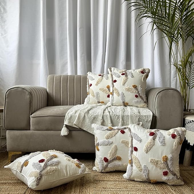
One of the easiest and most affordable ways to enhance the design of any space is through the use of pillows. Incorporating different pillow sizes, textures, and patterns can add dimension and depth to a room, transforming a plain setup into something that looks professionally curated.
Tips-
- Use pillow inserts with interchangeable pillow covers to update the look of a room without the need to purchase new pillows entirely. This allows flexibility for changing seasons, trends, or color palettes.
- Style pillows in groups of three and incorporate different sizes to create a dynamic, layered look. For example, place a large pillow at the back, followed by a medium pillow, and finish with a smaller, lumbar pillow.
- Play with textures and patterns to ensure every pillow stands out while contributing to the overall aesthetic.
2. Rule of Three in Styling
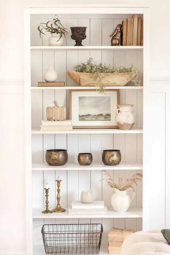
The rule of three is a simple yet effective principle in interior design that helps to create visually appealing spaces. It involves grouping items in sets of three, which naturally forms a balanced triangular arrangement that is easy on the eye.
When styling various areas of the home, such as coffee tables, mantels, or shelves, it is important to combine items of different sizes, textures, and colors. This adds both contrast and interest, preventing the space from looking cluttered or monotonous.
Tips-
- Group three items of varying heights, such as a vase, a candle, and a framed photo, on a mantel.
- For coffee tables, consider arranging books, a decorative object, and a small plant to achieve balance.
- Using the rule of three across different parts of the home results in a consistent, intentional design that enhances the overall décor.
3. Proper Wall Art Placement
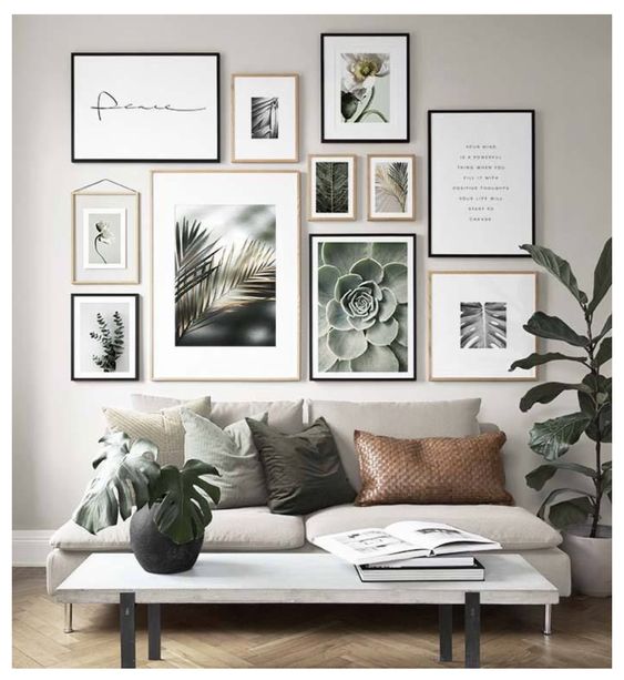
Hanging wall art can be tricky, but when done right, it can completely transform the feel of a room. A useful rule of thumb is to hang artwork at a height of 57 inches from the floor, which aligns with the average eye level and helps create harmony between the décor and the art.
For gallery walls, start at this midpoint and work outward to ensure balance. When hanging large-scale art, make sure it is centered in relation to nearby furniture, such as above a sofa or console table, to anchor the space and avoid the look of art “floating” on the wall.
Tips-
- Ensure that 57 inches refers to the center of the artwork, not the nail or hanger, which should be slightly higher.
- For gallery walls, use this midpoint as a starting guide and build around it to create a balanced look.
4. Mixing Patterns with Confidence
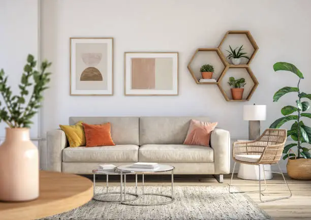
Patterns can either elevate or overwhelm a space, so it is important to use them strategically. When combining patterns, focus on scale and type of the patterns. A safe approach is to mix one large-scale pattern with two smaller-scale patterns.
Tips
- Focus on one dominant pattern and complement it with smaller, subtle patterns.
- Mix geometric designs with florals or solids for a balanced look.
[Image suggestion: A living room featuring a large patterned rug, with smaller patterns on throw pillows and curtains]
5. Achieving Balance and Symmetry
Creating balance in a room ensures that the space feels harmonious and organized. Balance can be achieved by distributing furniture and decorative elements evenly throughout the room so that no single area feels heavier or more crowded than another.
Consider balancing the placement of sofas, artwork, lighting, and plants. For example, a sofa might be balanced by placing a large artwork or mirror on the opposite wall, while matching lamps on either side of the sofa can create symmetry.
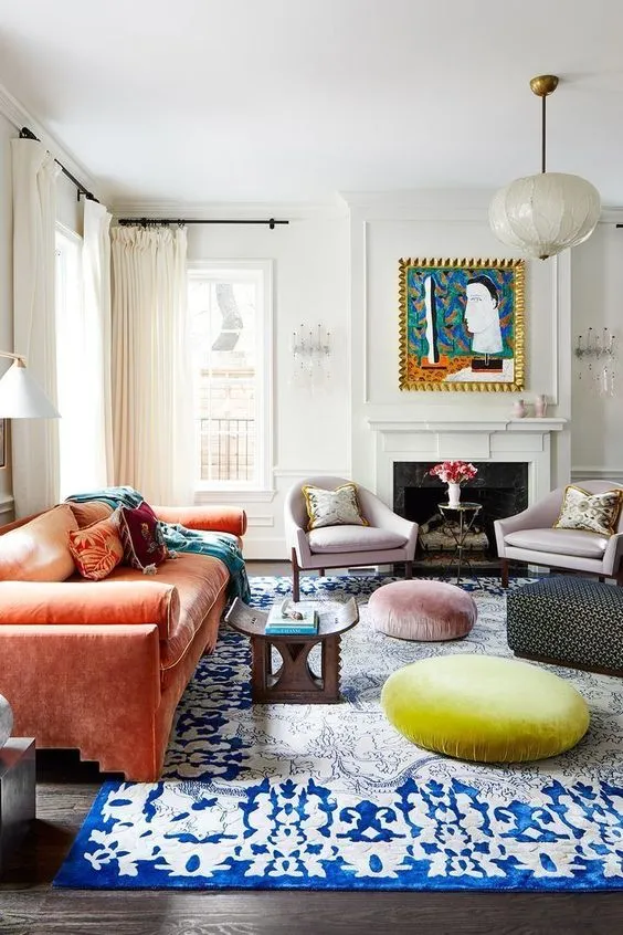
Tips
- Distribute elements like furniture, art, and décor evenly across the room.
- Balance can be achieved through symmetry (e.g., matching lamps on either side of a sofa) or by using different but complementary elements on each side of a room.
6. Pay Attention to Scale
In design, scale refers to the size of objects in relation to the space they occupy. Misjudging scale can disrupt the harmony of a room. For instance, small pieces of furniture in a large room may feel lost, while overly large items can dominate and crowd a space.
Always measure the room and consider the height of ceilings and the overall room size when choosing furniture and décor. Additionally, artwork should be appropriately scaled to fit the space—avoid hanging small pieces of art on large walls, as they can appear disconnected.
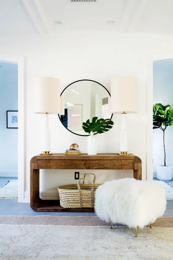
Common scale mistakes-
- Artwork that is too small for the wall it’s placed on.
- Oversized furniture in small spaces that makes the room feel cramped.
[Image suggestion: A room with appropriately scaled furniture and artwork, showing a well-balanced design]
7. Using Color Effectively
Color is one of the most impactful elements of design, and it can either make or break the cohesiveness of a space. When working with color, it’s essential to decide whether to go monochromatic (using shades of one color) or to introduce pops of color against a neutral palette. Additionally, it’s important to ensure that the colors used are balanced throughout the room to prevent an uneven distribution of color.
For those wanting a bolder look, mixing complementary colors can create an exciting contrast, but the key is to use these colors in muted tones rather than loud primary shades.
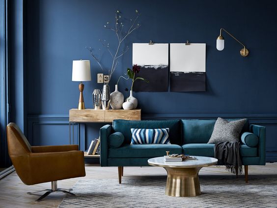
Tips-
- Use monochromatic schemes for a sophisticated and layered look.
- Introduce pops of color to liven up a neutral space.
- Mix complementary colors in subtle shades to avoid overwhelming the room.
[Image suggestion: A living room with a neutral palette and pops of color through accessories like pillows and artwork]
8. Creating a Cohesive Look
Achieving a cohesive look throughout the home involves maintaining consistency in color, texture, and style across different spaces. By using the same color palette and incorporating complementary textures throughout adjoining rooms, the home will have a seamless and well-coordinated appearance.
While bedrooms and closed-off areas can be styled differently, open spaces such as living rooms, dining rooms, and hallways should flow together in terms of color and design. The goal is to create harmony between rooms so that each space complements the others.
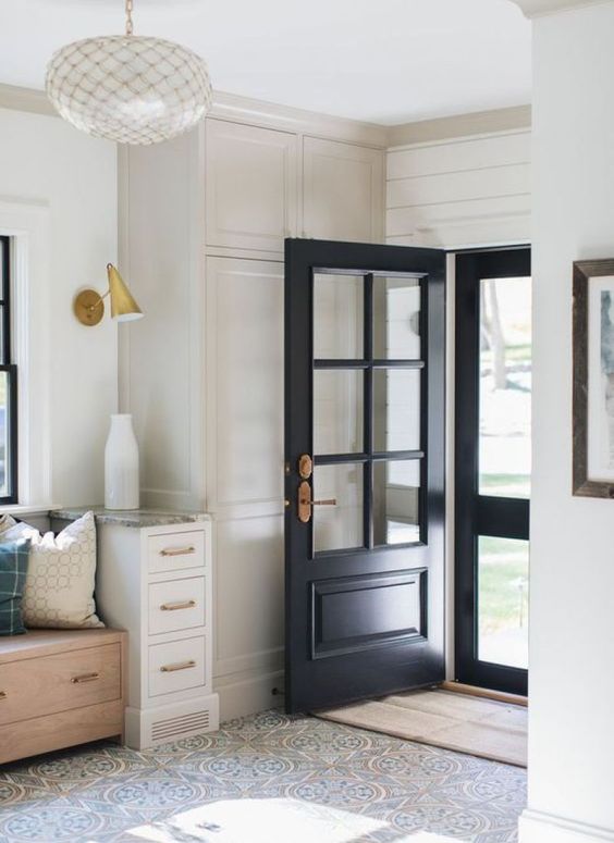
Tips
- Stick to a consistent color palette throughout the main areas of the home.
- Use similar textures and materials in different rooms for a uniform feel.


